
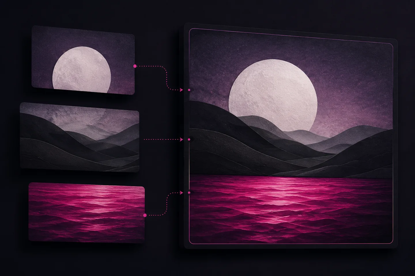
To combine multiple images into one, first decide whether you need a collage, a seamless scene, a panorama or a contact sheet. Each requires a different approach. A collage depends on cropping and spacing; a believable composite also needs compatible perspective, light and scale.
Work from copies of your source files and keep an editable project alongside the finished export. This lets you replace a photograph, adjust a crop or change the output size without rebuilding the arrangement.
Choose the arrangement
In a collage, each photograph remains visibly separate. Use a regular grid for comparisons or a contact sheet, where predictable order matters. For a collection with one main subject, give that image a larger panel and arrange supporting photographs around it. Avoid giving every image equal space when their importance differs.
A layered composite blends parts of photographs into one scene. Choose sources with similar camera angles and lighting before attempting detailed masking. A subject photographed from above will be difficult to place convincingly in a background photographed from below.
A panorama joins overlapping views of the same scene. It needs alignment and often distortion correction, rather than simply placing frames beside each other. Frames taken from substantially different positions can contain mismatched foreground and background details that are difficult to reconcile.
Set the canvas and spacing
Choose the canvas aspect ratio for its destination: a landscape display, portrait page or square layout. Then set its pixel dimensions. For print, establish the required physical size and resolution before arranging photographs; for screen use, work towards the dimensions at which the image will appear.
Plan margins and gaps before placing images. For example, a 1600-pixel-wide canvas with two columns, 40-pixel outer margins and a 20-pixel central gap leaves 750 pixels for each column. Calculating this prevents small alignment errors from accumulating across the layout.
Use a neutral background unless colour serves a clear purpose. Consistent borders can bring differently shaped photographs together, but heavy borders reduce the space available for detail. Leave sufficient room around faces, objects and any text already present within a photograph.
Prepare the source files
Remove duplicates, put the images in their intended order and check that each opens correctly. Compare orientation, pixel dimensions and sharpness. A small source image may look acceptable in a thumbnail but become visibly soft when enlarged to fill a large panel.
Decide whether each image should fit entirely inside its frame or fill it through cropping. Fitting preserves the whole image but can leave empty space. Filling removes that space at the cost of content near the edges. Never stretch width and height independently to force a fit.
Adjust crops individually, even in a regular grid. Centre the subject rather than automatically centring the file, and check for cut-off hands, faces or lettering. If a crop removes essential information, change the panel shape or choose another photograph.
Check rotation before arranging files, particularly in a browser-based workflow. Orientation metadata can affect how an image appears. For implementation details concerning intrinsic dimensions and orientation, consult MDN’s drawImage documentation.
Build the layout with separate layers
- Create the canvas with the chosen dimensions and background.
- Import each photograph onto its own layer and give it a recognisable name.
- Position the main image first, then arrange the remaining images around it.
- Resize proportionally, refine each crop and align panel edges.
- Check margins and gaps at the intended viewing size.
- Save the editable project before exporting a flattened copy.
Separate layers let you edit individual elements without affecting the rest of the composition. Reposition and transform cutouts within one document, then adjust their stacking order. Keep the background below the foreground elements and place any deliberate overlapping frames above the photographs they surround.
For a cutout, use a mask instead of permanently erasing pixels. Refine its edge while zoomed in, then zoom out to judge the result as a whole. Excessive feathering can create a halo, while a uniformly hard edge can look unnatural against a softly focused background.
Match light, scale and colour
In a composite scene, establish the horizon and viewing angle before spending time on colour. Compare the inserted subject with familiar objects such as doors or chairs. If its size or ground contact looks wrong, correct that first; colour adjustments cannot repair incompatible perspective.
Compare the direction and softness of the light across the source photographs. Highlights and cast shadows should suggest compatible illumination. A strongly side-lit subject may remain unconvincing in a scene lit evenly from above, even after exposure adjustments.
Make modest changes to white balance, exposure, contrast and saturation. In a collage, these can reduce distracting differences between neighbouring frames. In a composite, also compare sharpness and texture: an extremely crisp cutout against a soft background may need a different source or a gentler treatment.
Do not use a strong overall colour effect to conceal unfinished edges or mismatched shadows. Temporarily hide adjustments when checking the mask, and inspect the subject against both light and dark backgrounds to expose fringes.
Combine images in a browser workflow
A basic browser combiner can draw images onto a canvas, using destination positions and dimensions for each panel. Drawing can also crop a source rectangle before scaling it. The MDN API reference provides the drawing forms and their parameters.
Wait for every source image to load, measure its natural dimensions and calculate all destination rectangles before drawing. Set the canvas dimensions first, then draw in the intended stacking order. For a grid, derive positions from the margins, column widths and gutters rather than estimating them separately.
For a vertical strip, use a consistent output width and calculate each image’s height from its aspect ratio. Add those heights and the gaps to determine the total canvas height. This preserves proportions without forcing unrelated images into identical crops.
Keep the originals available when using a simple combiner that cannot save layers. Record the canvas size, panel order and spacing so you can reproduce the arrangement. If an image looks wrong after import, correct its orientation before recalculating the layout. Check a small trial export before committing time to a long strip or a densely packed grid of photographs.
Export and inspect the result
Choose the delivery format according to the content. JPEG suits photographic output where some lossy compression is acceptable. PNG supports transparency and is useful for crisp text or shapes. Keep the layered project separately, because a flattened export does not preserve independent photographs or masks.
Open the exported file rather than relying on the editor preview. Check the full image for alignment, then inspect detailed areas for seams, halos, clipped lettering and compression artefacts. Confirm that transparent areas remain transparent and that the output dimensions match the intended destination.
For web publication, provide alternative text that communicates the image’s purpose. Describe informative content briefly; if the combined image presents a complex comparison or sequence, explain the necessary detail in accompanying text. The W3C Images Tutorial covers the different treatments for informative, decorative and complex images.
Before handing over the file, check that small panels remain understandable at the actual viewing size. If their details disappear, reduce the number of photographs or use a larger layout. Save the final export with a descriptive filename that distinguishes it from the editable project.